The National Academies Press issued an 80-page report, in May 2017, entitled “Guidelines for Nighttime Overhead Sign Visibility.” It includes a chart headlined “Luminance Levels for Overhead Signs.” It lists five different visual complexity levels, ranging from a dark rural area to a commercial downtown district. It then suggests minimum luminance levels in terms of candelas per square foot and […]
A study conducted jointly by the Texas and Pennsylvania Departments of Transportation in April 2006 concluded the Clearview font increased the visibility distance for drives by 12% versus the existing Series E Modified font. In 1994, the Federal Highway Administration determined highway signs were no longer visible enough for a population that included older drivers. Over the next […]

The answer is a very clear “no.” An article by FASI President/Executive Director Bill Dundas published in the January 2016 issue of Signs of the Times magazine explains that electric signs are not lighting devices, per se. Their purpose is not to provide light, but to deliver messages. Thus, they should not be regulated as […]

The most common restriction in sign codes concerns the size of signs. This includes such considerations as the “setback,” (distance away from the road), the height and the dimensions of the sign itself. When the sign is a rectangle, and the copy fills it, it’s easy — height x width. A 4 x 6-foot sign […]

The Larson Transportation Institute at Penn State University conducted a study on font legibility through a grant from Gemini Inc. (Cannon Falls, MN), a manufacturer of dimensional letters. The following is the Executive Summary from the report. For information about the full report, contact Philip Garvey at [email protected]. Background and objectives The enormous font selection […]
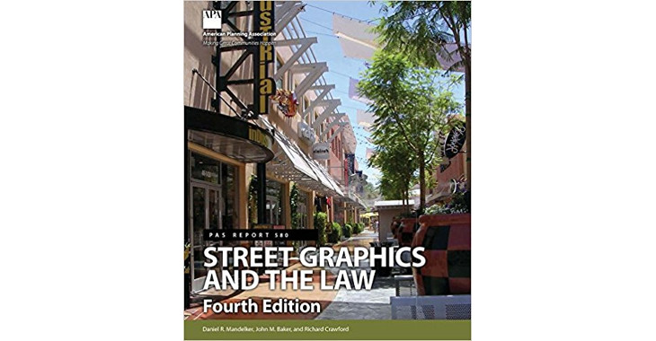
In 1971, the American Planning Association (APA) began distributing a book called Street Graphics and the Law, which was authored by Daniel Mandelker and William Ewald. It recommended the uncompensated taking of signs and governmental control of signs’ design, message and content. The authors stated that their conclusions were substantially based on 1956 research conducted […]

A critical aspect of any sign is viewing distance. The appropriate amount of detail varies greatly, depending on the distance from which the sign will be viewed. In digital printing, this “resolution” is determined by “dots per inch,” or DPI. The more closely an image will be viewed, the higher its resolution needs to be, […]

The difference in conspicuity for parallel and perpendicular signs has been calculated by Penn State research, along with the requisite minimum sizes for the letters of each. But what if the local sign code won’t allow a bigger sign, and not enough projection length for a legible perpendicular sign? Would a sign with at least […]

In 1985, the city of Agoura Hills, California enacted a sign ordinance that prohibited all pole signs, with the exception of a few that were less than 6 feet tall. It included an amortization period that ended in March 1992, at which time all of the pole signs would have to come down, without any […]
When a Pier 1 Imports store opened in Germantown, TN (a suburb of Memphis) in 1991, it was granted a permit for a sign that faced west-bound traffic. However, no signage was visible to east-bound traffic. A few months after the store’s opening, sales were 25% below projections, despite typical promotions, advertising and direct mailings. […]